 |
| A Dozen Design Hacks |
Have you ever hung a piece of art and it didn’t look as striking as it should have? Or bought a rug because it looked so lovely in the store, but not when you laid it on your floor? Or moved your grandmother’s heirloom teapots from spot to spot, but they still looked like clutter no matter where you put them?
[post_ads_2]
There are basic guidelines for decorating a home, from how high to hang art to how to blend new and old household items. Sure, there’s creative license, but a few rules of thumb are a useful starting point. With those in mind, eye-pleasing designs are easy to achieve, even for the inexperienced. To help decorating rookies get started, we talked to local interior designers to get their favorite design hacks.
1
Paint After Furnishings
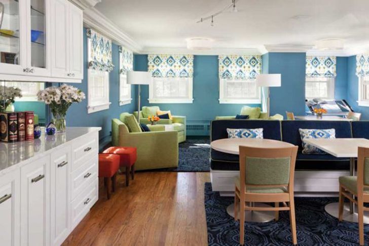
Choose wall paint after the furnishings are in place. “Design your room first, then choose a paint color, even if it’s a year later,” suggests Donna Pocci of Pocci Design Group in Boulder. Once you’ve got the décor you want, find the colors that speak to you in your favorite accessories, like the artwork or fabrics, and paint accordingly.
2
Focal Point
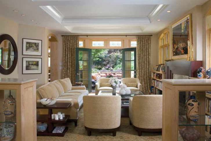
A room needs a focal point. Natural focal points are fireplaces and beautiful window views, says Anne Jaffe with Boulder’s Jerdadan Designs. But you can create your own with lighting, striking art, and interestingly painted walls or special-textured walls.
3
Hanging Art
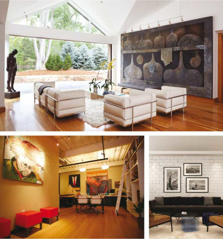
When hanging art, a good rule of thumb is to center the piece and hang it at eye level—so some 56 to [post_ads]60 inches from the floor and 5 to 9 inches above furniture. “That’s a great place to start,” Pocci says. Oversized or undersized art makes a more interesting design, she adds, and it can be visually pleasing if you have one wall with a large piece, another wall with a grouping and then maybe a third wall with a couple of medium-sized pieces together. “It adds more complexity,” she says. When doing groupings of framed art or photos, cut removable contact paper to each frame’s size and then group the paper on the wall so you can prearrange the pieces before drilling any holes.
4
Neutral Tones
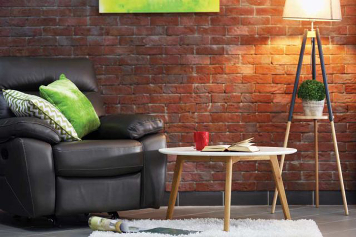
Choose neutral tones for large items, like sofas and area rugs, suggests Debbie Marden of D. Marden Interior Design in Boulder. Unlike busy patterns and bright colors, neutrals outlast fads and trends, and you won’t tire of them. Bring in pops of color with art, or accessories like pillows and throws.
5
Mirrors
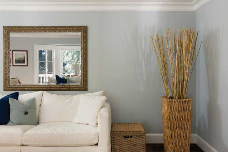
Mirrors invite and reflect natural light into a room, and make it look larger, says Marden. But pay close attention to what’s being reflected. Natural views and a gorgeous chandelier, perfect; dark walls and a messy office, not so much.
By Ruthanne Johnson | Home And Garden Mag


