 |
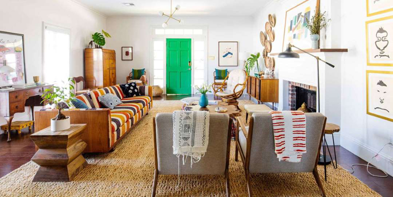
| © Courtesy of Old Brand New We asked a couple design experts to weigh in and tell us which of these rules are worth holding on to-and which ones are more than okay to ditch. |
By Maggie Burch, House Beautiful
Paint small rooms white. Hang artwork at eye level on your walls. Don't mix two large-scale patterns in the same space. Use decor of varying heights. When it comes to interior design, there are so many tips and warnings thrown around about furniture and decor that it can end up intimidating to trust your own sense of style. We've probably all had a moment when we saw a fabric pattern or piece of furniture that we liked but stopped ourselves from buying it or using it in a certain spot because some rule popped into our head telling us not to. It's hard to say where or when many of these generally accepted design rules originated, but whether we realized it or not, they've become second nature for many of us. But should they be? We asked a couple design experts to weigh in and tell us which of these rules are worth holding on to-and which ones are more than okay to ditch.
Rules about interior design are not inherently a bad thing. In fact, as Dabito, the creative force behind Old Brand New, points out, "Rules are in place to help guide us." We may not all have the magic eye an interior designer does, but we can try to mimic their work by turning it into a formula and hoping our own space might look a fraction as stylish. Rules like Choose a living room rug that's large enough for the front legs of all your furniture to sit on are repeated because scale and proportion are key in design. And pieces that aren't the right size for a certain room can throw off the whole look and feel of the space. Dabito emphasizes this point: "Scale and proportion are important in a space. Measure, measure, measure!"
So what rules do you not need to follow? Here's what the pros had to say:
Old-school Rule: Use the same metal finish throughout a room.
"Matching metals seems rather outdated now," says Megan Bachmann, a California-based interior designer. "I love mixing metals in (almost) every room! It feels so fresh and current," she says. Dabito agrees, and says he doesn't think enough people feel comfortable going against this more traditional rule. Never been one to mix gold and silver? There are a few tricks to make this design choice look seamless. First, make sure your different metals are in fact distinctly different. Shiny silver chrome and brushed nickel are too close that their pairing will look accidental and clash-y, not intentional. Megan also suggests allowing "one metal to be the hero color while the others are the accents."
 |
| © Jonny Valiant 3 Outdated Design “Rules” You Shouldn't Follow |
Old-School Rule: Follow the 60-30-10 guide for color.
The 60-30-10 rule refers to using your main, focal color in 60 percent of your space (on the walls, in big pieces of furniture, in the rug), a secondary color in 30 percent of your space (in smaller furniture pieces, window treatments, and pillows), and an accent color in 10 percent of your space (in lamps, art, and as accents in fabric used throughout the space). The premise of this rule is to make it easier for people to feel confident when painting or buying big items. "I think it can definitely help people bring color into a space," Dabito says, "but I feel like that's limiting as well." One look at Dabito's blog documenting his design work and you'll quickly see that he doesn't limit the number or intensity of colors he incorporates into any space. "I'm a maximalist at heart so I don't really follow it."
 |
| © Courtesy of Old Brand New 3 Outdated Design “Rules” You Shouldn't Follow |
If you like color, embrace bright and bold hues. If you prefer muted neutrals, stick with a monochromatic palette. Once you understand how colors work together, how you use them is up to you.
Old-School Rule: All wood stains need to match.
"Wood doesn't need to all match," Megan says. "It just needs to 'go.'" In fact, following this rule could leave you with a room that looks like the entire set of furniture was ordered out of a catalog-and not the West Elm catalog. Matchy-matchy wood furniture can look cheap, and even worse, boring. Even so, Megan says this is a rule some of her clients have a hard time breaking. She points out that mixing different woods "makes a room feel finished and layered; it makes it seem like the room came together over time." As long as you aren't living in a log cabin with zero upholstered fabric, mixing up the wood finishes of your furniture doesn't really need to be something you think too much about. Once you bring in color on the walls and in upholstery and art, all the wood finishes will serve as a fairly neutral backdrop in your space.


